Mar 5, 2025
Building a Featured Logo Section in Webflow
Welcome to this hands-on tutorial where we dive into creating a stunning featured logo section for your website using Webflow. This section is perfect for showcasing your partners or clients and can significantly enhance your site's visual appeal. Whether you're a beginner or an experienced developer, this step-by-step guide will help you implement a professional-looking logo strip effectively. Let’s get started!
Understanding the Design Concept
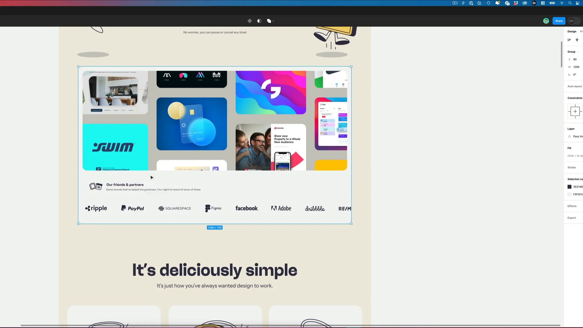
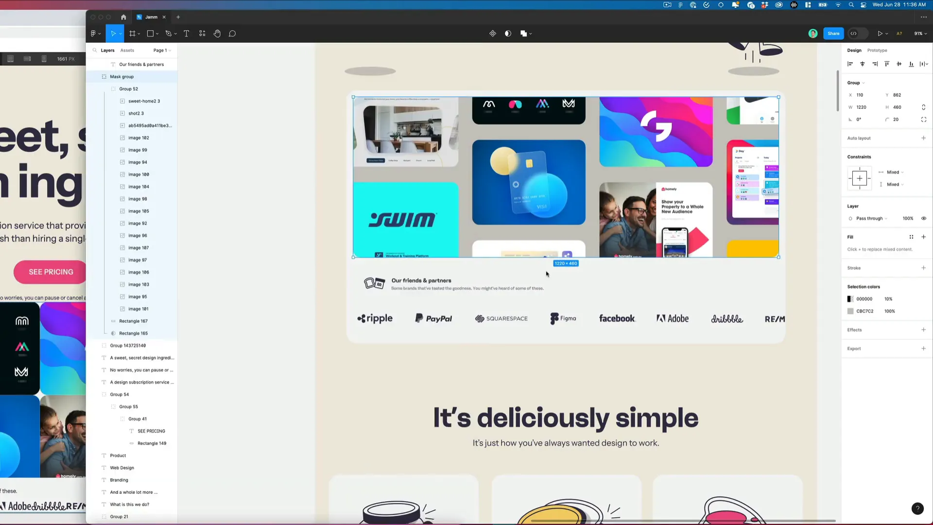
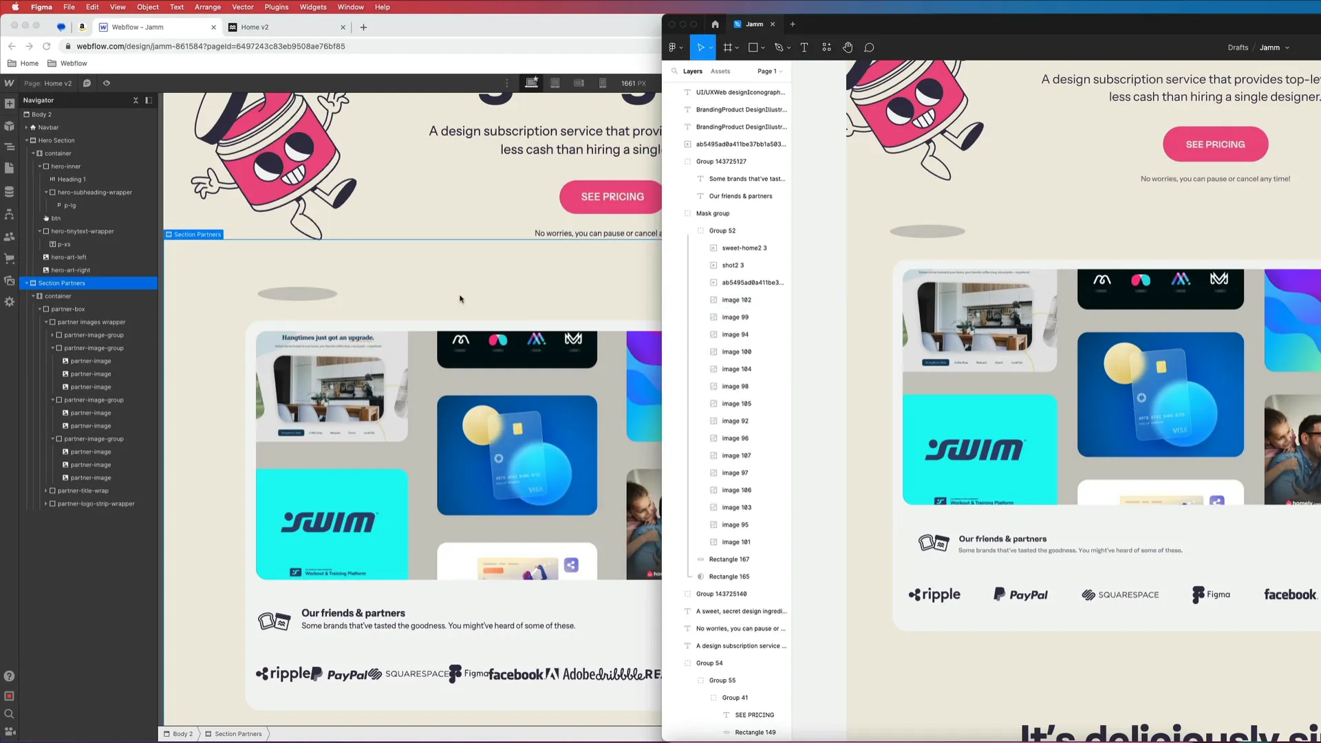
We begin with a design concept from Figma that outlines how our logo section will look. This includes a clean layout with a title, a logo strip, and some explanatory text. The goal is to create a section that is visually appealing and informative, giving visitors a quick overview of the brands you work with.
Extracting Assets from Figma
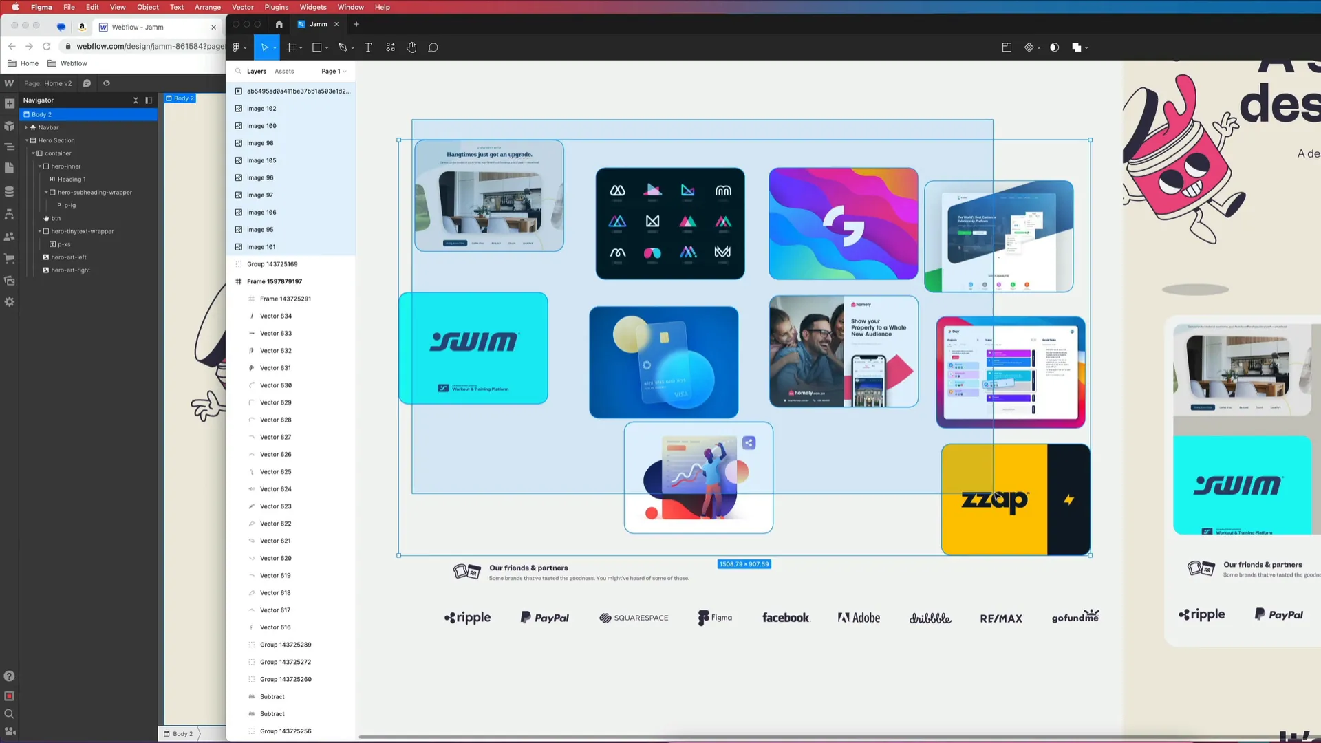
The first step in our process is to extract all necessary assets from Figma. This involves downloading the images and logos that will be used in our Webflow project. Ensure you have all logos ready to go, as they will be integral to the section we’re building.
Setting Up in Webflow
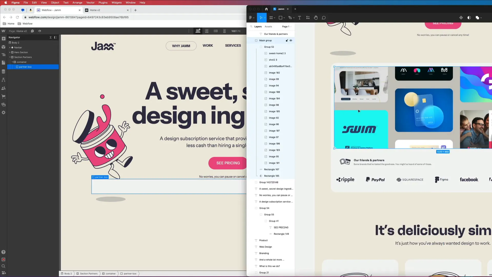
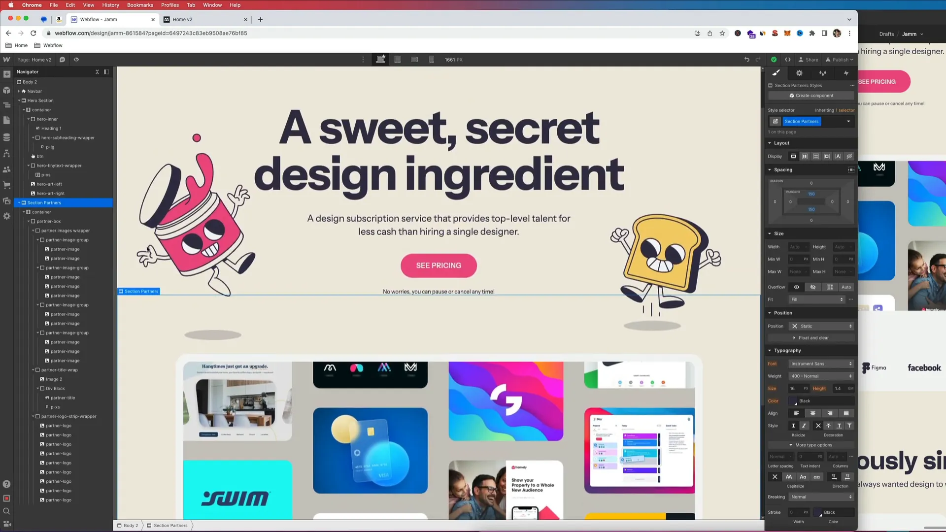
Now that we have our assets, let’s move into Webflow. Start by creating a new section for our partners. This section will be housed within a container to maintain proper alignment and spacing.
1. **Add a Container**: In Webflow, add a container element to your project. This will serve as the main wrapper for our logo section.
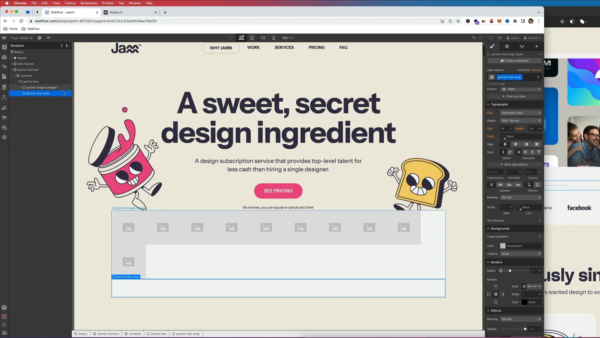
2. **Create the Partner Box**: Inside the container, create a div and name it "Partner Box." This will hold all the content for our logo section. Set its background color to a light shade (e.g., #F5F5F5).
Creating the Image Wrapper
Next, we’ll create a wrapper for our logos:
- Create a new div inside the Partner Box and name it "Partner Images Wrapper."
- Add 10 image elements (one for each logo) and assign them the class "Partner Image." For now, just copy and paste the image element to create ten instances.
Adding Title and Subtitle
We’ll also need to add a title and subtitle to explain the section. Here’s how:
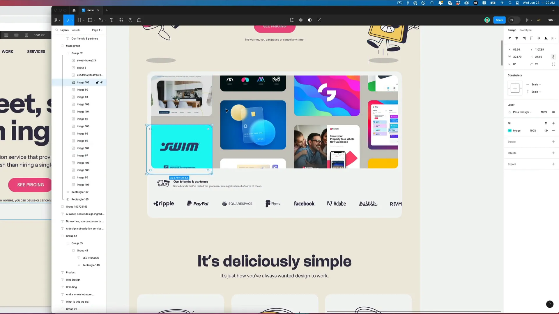
- Create another div called "Partner Title Wrap" inside the Partner Box.
- Upload a small icon for visual appeal, then add a heading for the title ("Our Friends and Partners") and a subtitle that describes this section.
- Use Flexbox to align the title and icon side by side.
Styling the Elements
With our structure in place, it’s time to style our elements for a polished look.
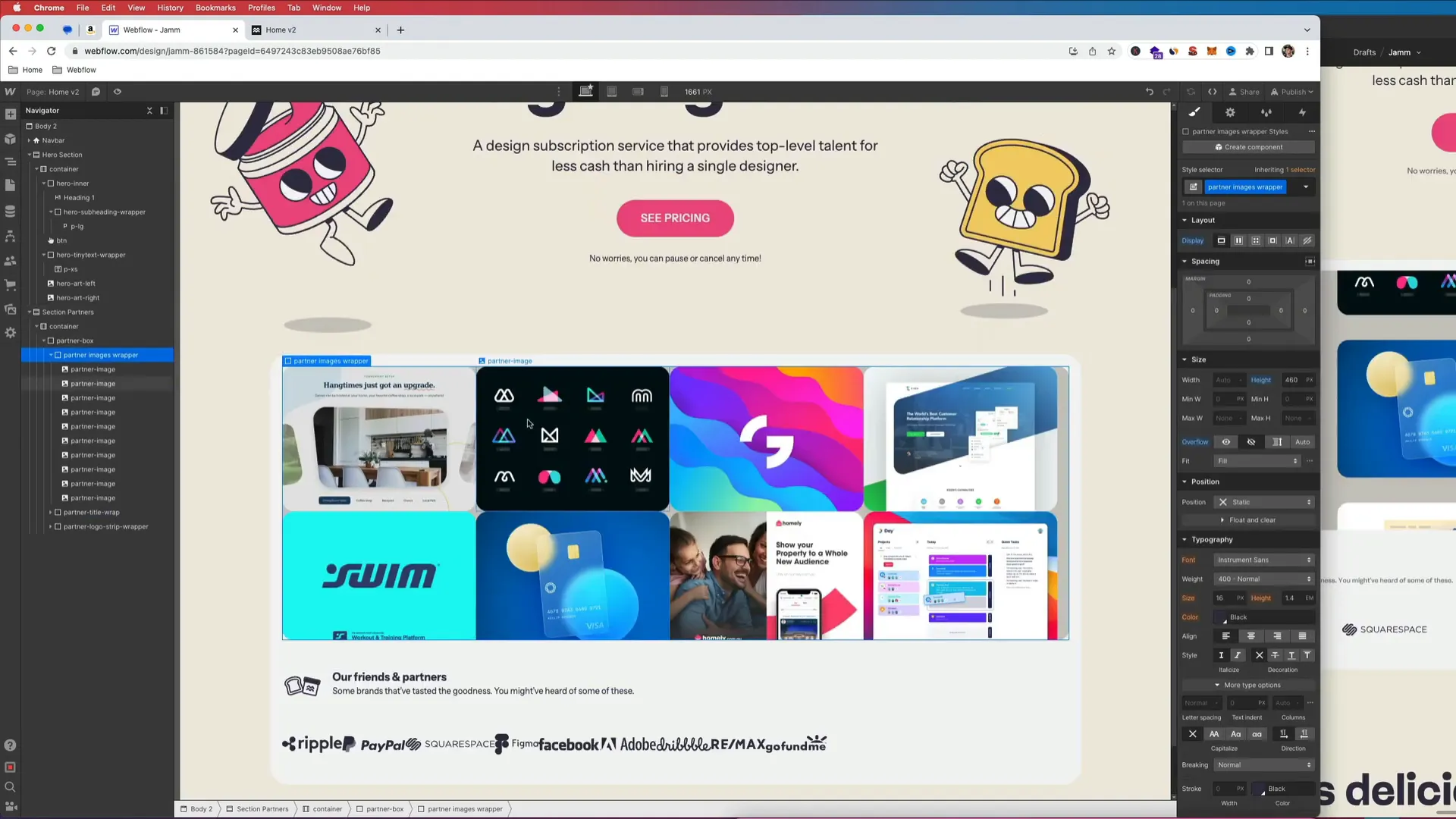
1. **Set Fixed Height**: Assign a fixed height of 460px to the "Partner Images Wrapper" to ensure all logos fit well.
2. **Add Padding**: Give the Partner Box padding of 20px on the top and sides, and 50px at the bottom for spacing.
Background and Border Radius
Next, we’ll add a background color and border radius:
- Set the background color of the "Partner Images Wrapper" to a soft gray to distinguish it from the rest of the section.
- Add a border radius of 20px to soften the edges.
Arranging the Logos
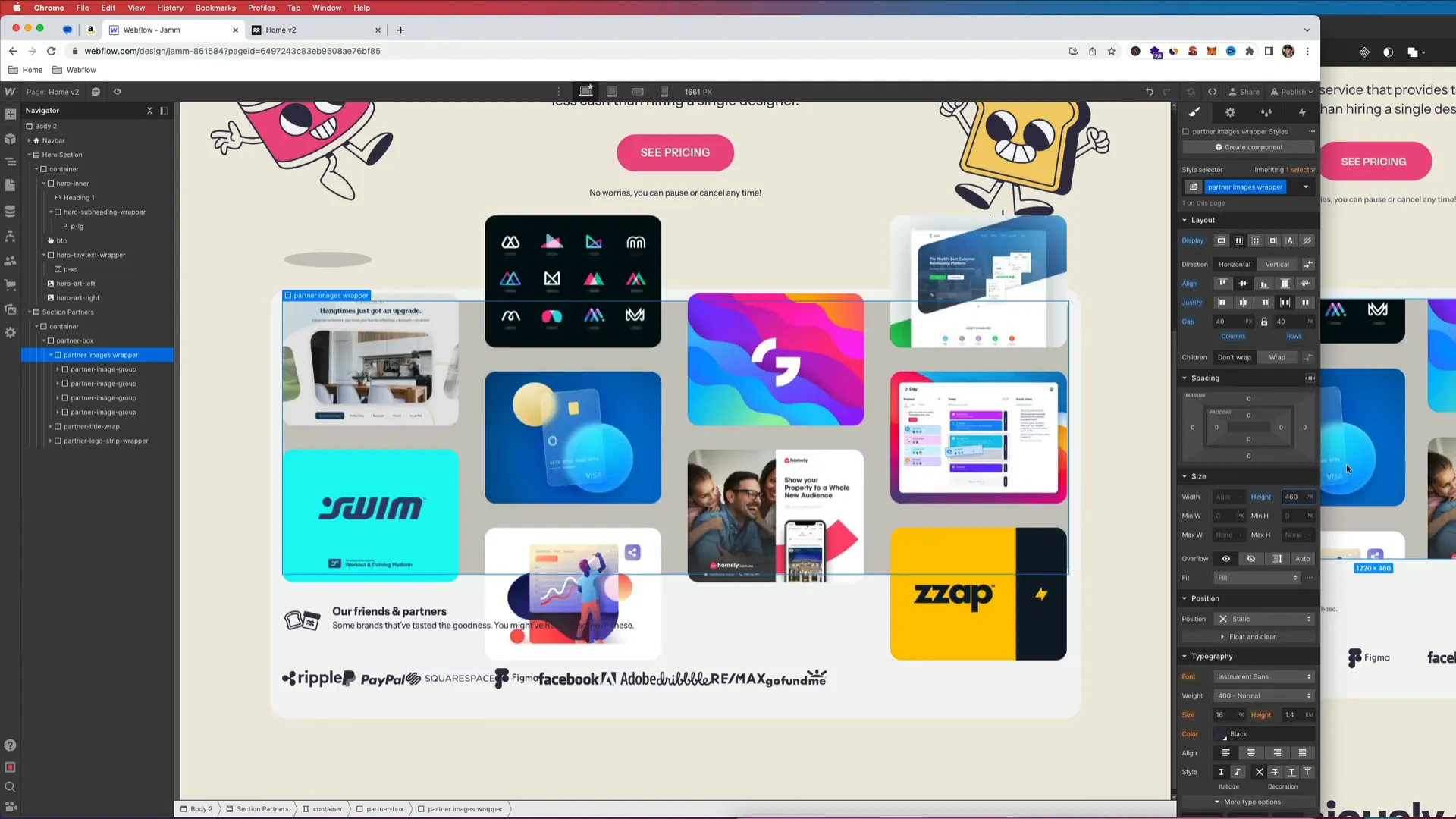
Now, let’s focus on arranging the logos within the wrapper. We want to ensure they are spaced evenly and look cohesive.
1. **Group Logos**: For better organization, group the logos into a flex container and set it to display in a row.
2. **Adjust Widths**: Remove any fixed widths on the logo images to allow them to scale responsively. Instead, assign them margins to create space between each logo.
Ensuring Responsiveness
We want our logo section to be responsive, adjusting nicely across different screen sizes. Here’s how to do it:
- Make sure the parent container uses Flexbox to center the logos.
- Adjust the flex properties to ensure logos align correctly and maintain spacing.
- Test how the logos respond as you resize the browser window.
Final Touches
With everything in place, we can add some final touches to enhance the overall look of our logo section:
- Add hover effects to the logos for interactivity.
- Consider adding subtle animations to make the section more dynamic.
- Review spacing and alignment one last time for a clean finish.
Conclusion
Congratulations! You’ve just built a featured logo section in Webflow that showcases your partners beautifully. This section not only enhances your site’s aesthetic but also provides valuable information to your visitors. If you need help with your project or want to collaborate, feel free to reach out. Remember to like, share, and subscribe for more tutorials like this. Happy designing!