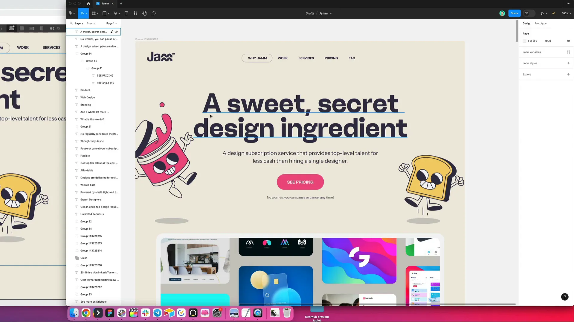
Today, we're diving into the exciting world of Webflow to craft a captivating hero section for your website. This is where we’ll focus on elements that make a strong first impression, including titles, illustrations, buttons, and text elements. Whether you’re a beginner or an experienced web designer, this guide will provide you with the steps to create a visually appealing and responsive hero section.
Starting with the Basics
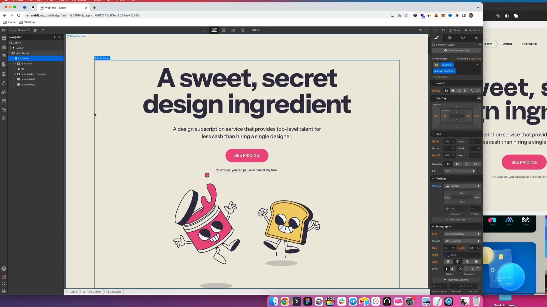
First things first, we need to set up our workspace in Webflow. The initial step involves creating a new section that we will designate as the hero section. This is crucial because the hero section is the most prominent part of your homepage and sets the tone for the rest of the site.
Once our section is created, we’ll add a container to keep our elements organized. A container helps in managing the layout, ensuring everything stays aligned and responsive across different devices.
Adding Text Elements
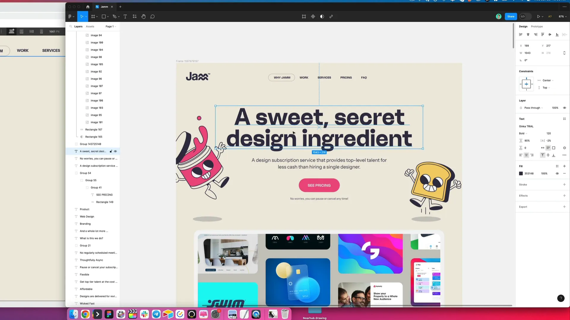
Next, we’ll focus on adding text elements. We’ll start with a heading, specifically an H1 title. Copy the desired text and paste it into the heading section. Underneath that, we’ll insert a paragraph to provide additional context.
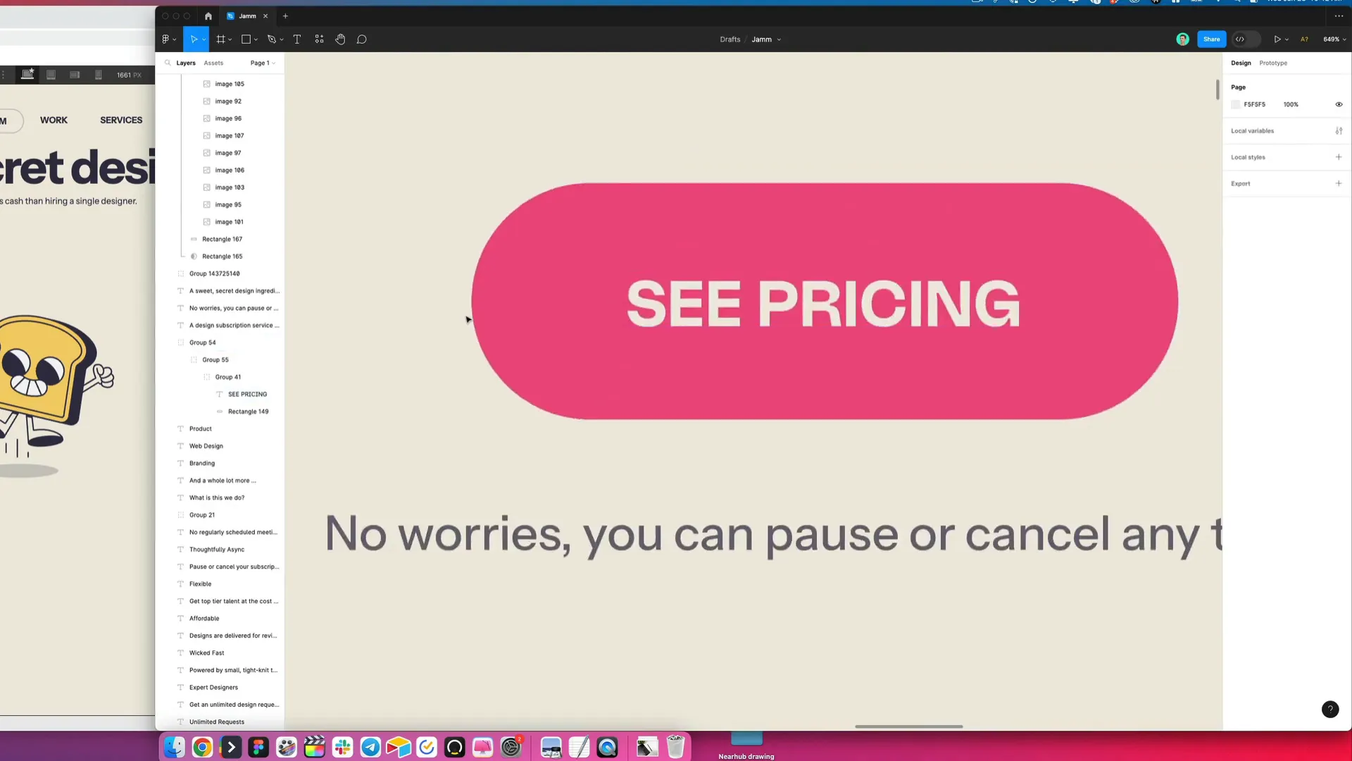
Additionally, we’ll include a call-to-action button labeled “See Pricing.” This button is essential for guiding users towards taking the next step, whether it’s exploring your services or making a purchase.
Incorporating Illustrations
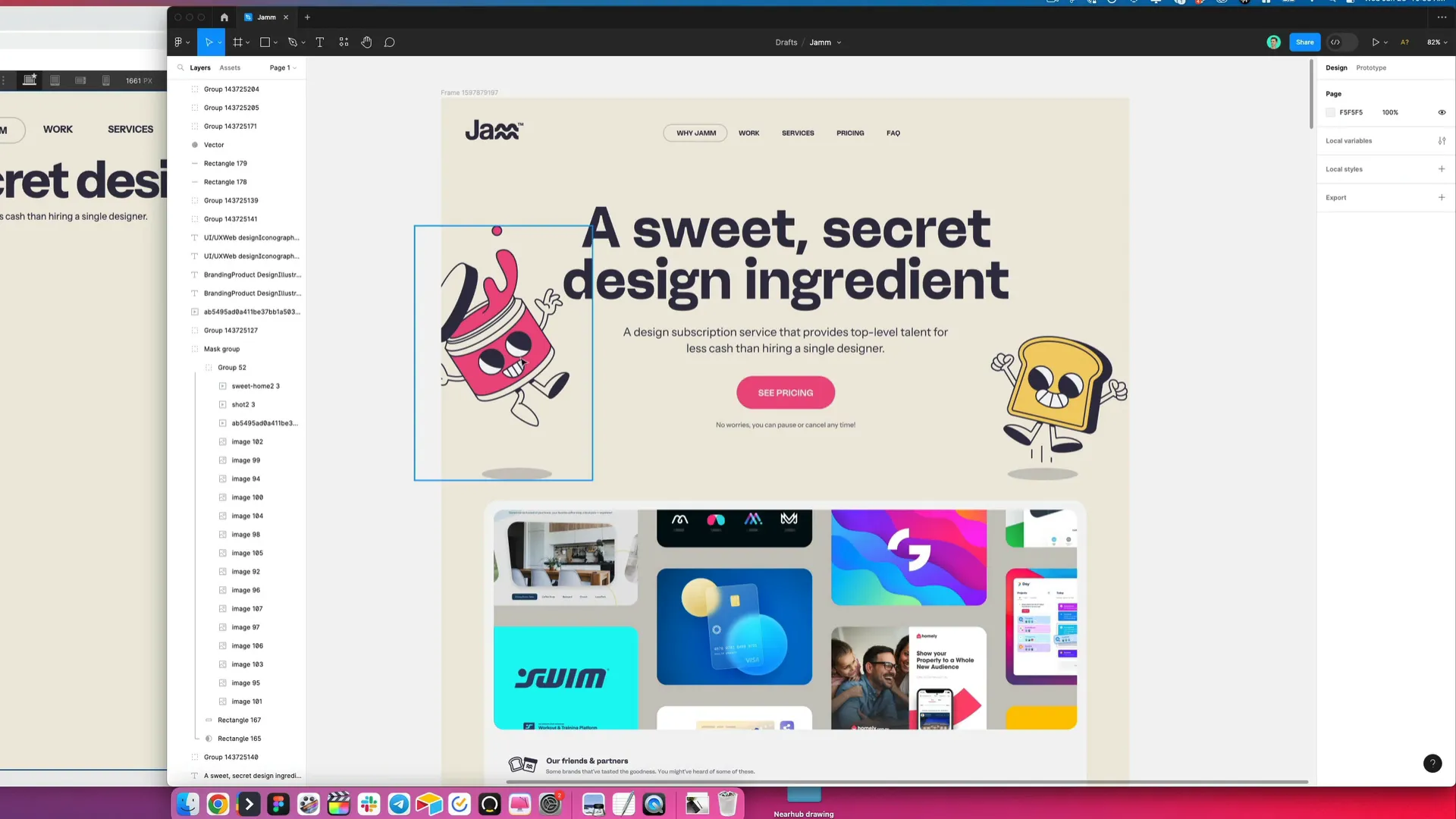
Now that we have our text elements in place, we can enhance the design by adding illustrations. We’ll export our illustrations as SVGs and upload them to Webflow. SVGs are great because they scale without losing quality, making them perfect for responsive designs.
To insert the illustrations, simply drag and drop them into the appropriate spots in your hero section. This will help in bringing your design to life, making it more engaging for visitors.
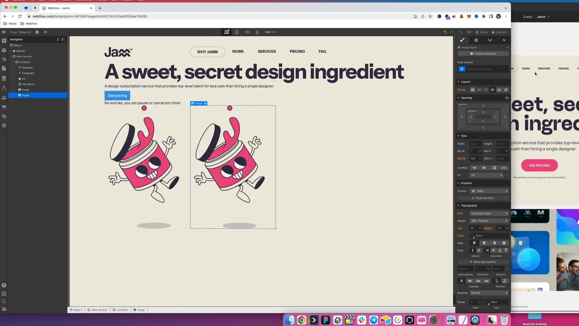
Styling the Button
With our basic elements in place, it’s time to focus on styling. The button is a crucial component of our hero section, and we want to ensure it stands out. Start by copying the button color from your design reference and updating it in Webflow.
We’ll also want to make the text uppercase, adjust the font weight to semi-bold, and add some letter spacing for a polished look. Additionally, we’ll change the button's text color to a tan shade, add a border radius for a rounded effect, and adjust the padding to give it a taller appearance.
Setting Up the Heading Styles
Next, let’s style our heading. We want it to make an impact, so we’ll set the font size to 120 pixels. This ensures it captures attention right away. As we adjust the font size, we must also consider how it will stack on smaller screens, so we’ll ensure it remains responsive.
For the subheading, we’ll set its size to 24 pixels, ensuring it’s noticeable but not overpowering. This will create a nice hierarchy in our text elements.
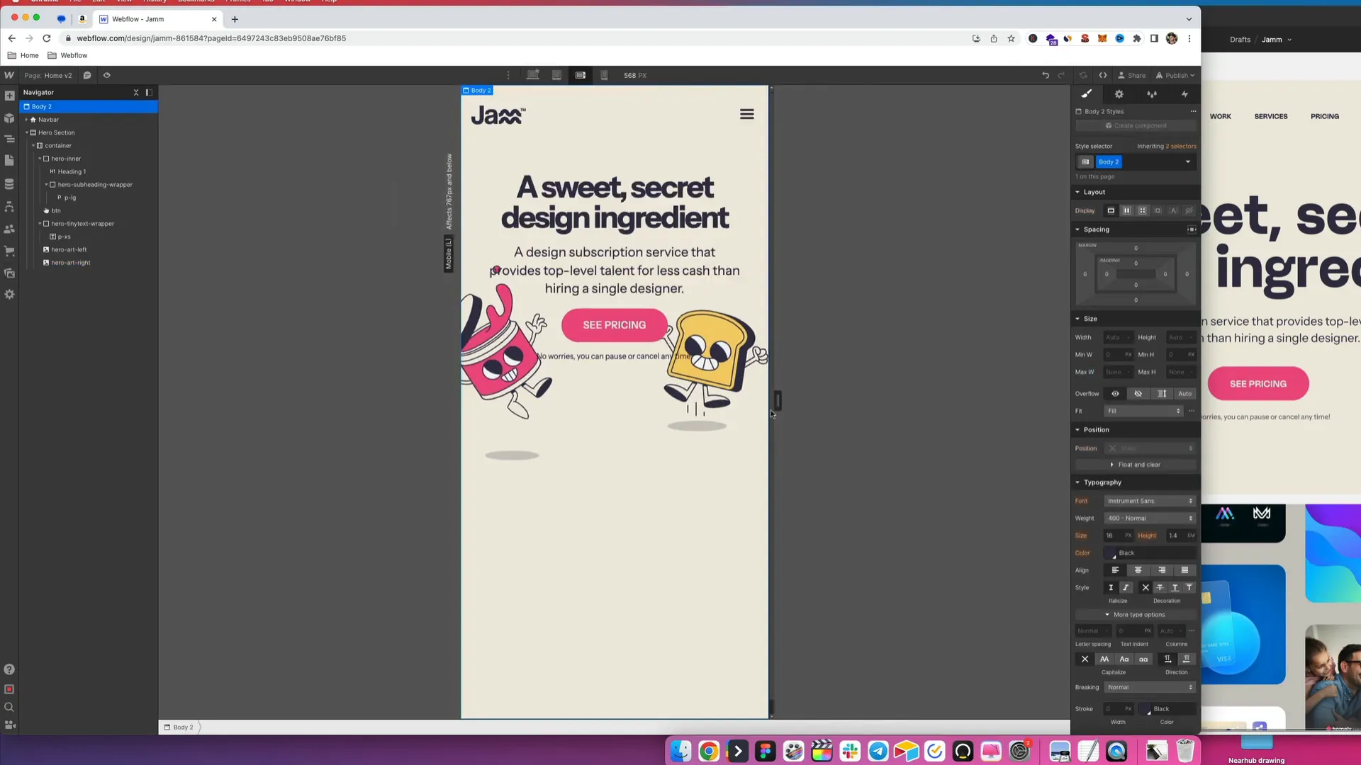
Responsive Design Considerations
Now that we have our styles in place, we need to think about responsiveness. We want our hero section to look great on all devices, from desktops to mobile phones. To achieve this, we’ll set max widths for our text containers and ensure everything is centered.
For instance, we can wrap our heading and subheading in a div and give it a max width of 80%. This will help keep our text aligned and prevent it from stretching too wide on larger screens.

Fine-Tuning the Layout
With the layout set, let’s fine-tune the positioning of our illustrations. We’ll give them a position of absolute to ensure they stay within the bounds of our hero section. This allows us to place them precisely where we want them in relation to our text elements.
We’ll also apply a z-index of -1 to ensure the text remains readable on top of the illustrations. This is especially important for mobile views, where overlapping elements can obscure content.
Testing Responsiveness
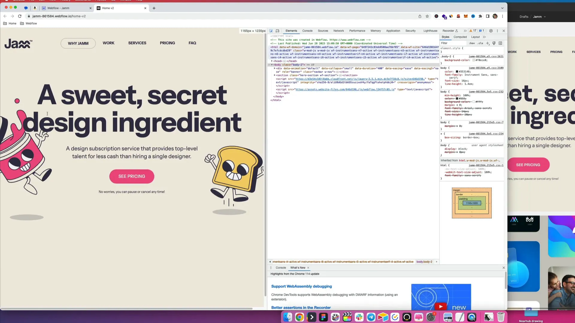
Now, it’s time to check how our hero section looks across different devices. Start by resizing your browser window or using the device preview options in Webflow. This will help you identify any areas that need adjustment.
For desktop views, everything should look great, but as we move to tablet and mobile views, we might need to reduce the size of our illustrations and adjust spacing to ensure a clean look.
Final Touches
After testing various screen sizes, we’ll make any necessary adjustments to ensure a flawless appearance. This includes modifying font sizes, reducing image sizes, and tweaking spacing to maintain visual balance.
Once we’re satisfied with the design on all devices, we can wrap up our hero section. It should now be engaging, visually appealing, and functional across all platforms.
Conclusion
Congratulations! You’ve successfully created a stunning hero section in Webflow. Remember, the hero section is your website’s first impression, so make it count. By following these steps, you can ensure that your hero section is not only beautiful but also functional and responsive.
Now, go ahead and apply these techniques to your projects, and watch how they elevate your website’s aesthetics and user experience!


