Mar 5, 2025
Featured
Webflow Navbar Styling Tutorial
Welcome to the ultimate guide on styling your Webflow navbar! In this tutorial, we’ll walk through the process of building a sleek and functional navigation bar inspired by a design from Figma. Whether you're a beginner or an experienced Webflow user, this blog will help you create an impressive navbar that enhances your website's user experience.
Getting Started with Webflow
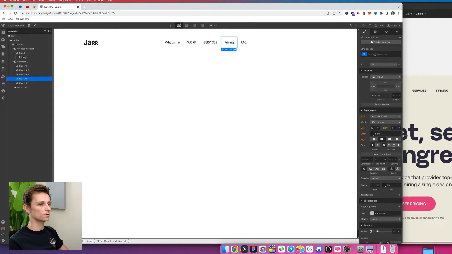
First things first, make sure you have created your Webflow project. Once that’s done, it’s time to dive into building the navbar. The design we’re working with features a simple layout with a logo and five menu items. To kick things off, let's utilize Webflow’s pre-made navbar component.
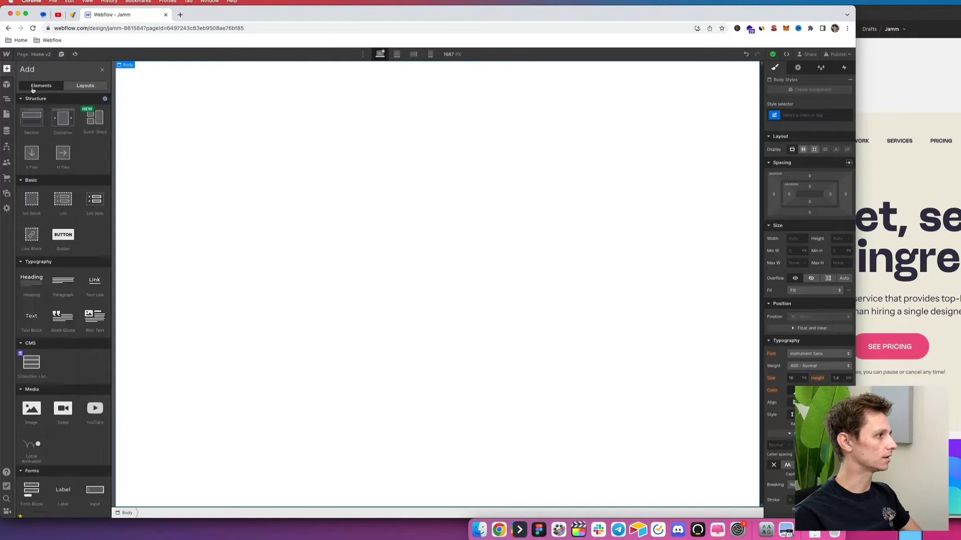
Head over to the elements section in Webflow and locate the pre-made navbar. This will serve as our starting point. Now, let’s get the ball rolling by adding our logo.
Adding Your Logo
To add your logo, you’ll want to click on the image element within the navbar. Make sure your logo is already uploaded to Webflow. Once you’ve selected the image element, click on “Choose File” and upload your logo.
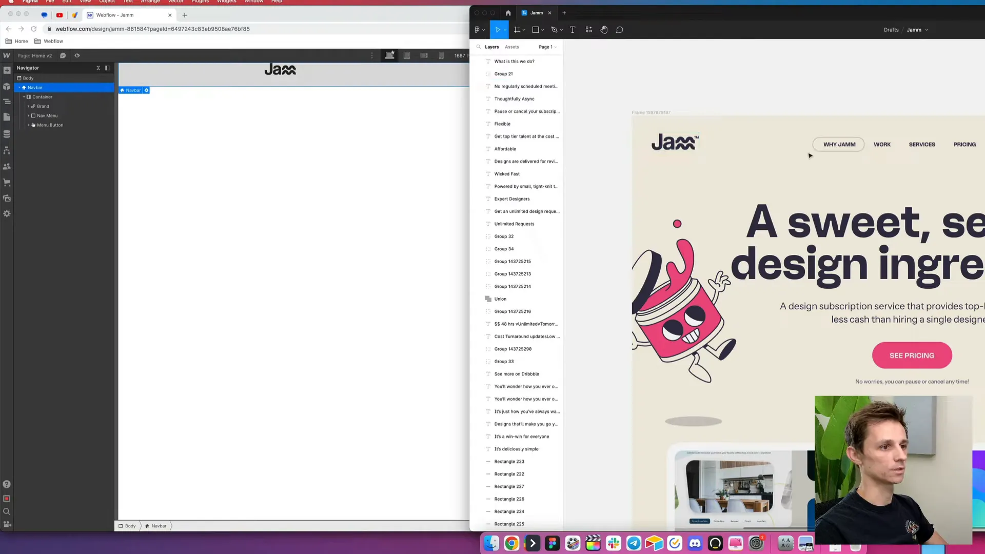
Now that we have our logo in place, it’s time to add our menu items. Make sure to input the same text for each menu item to ensure consistency. After entering the text, we need to center these menu items to achieve a polished look.
Centering the Menu Items
To center the menu items, we’ll place the logo in its own div block and set the navbar menu to be a full-width element. Start by creating a new div, placing the logo inside it, and make this div a block element with a width of 100%. Then, apply the text alignment to center.
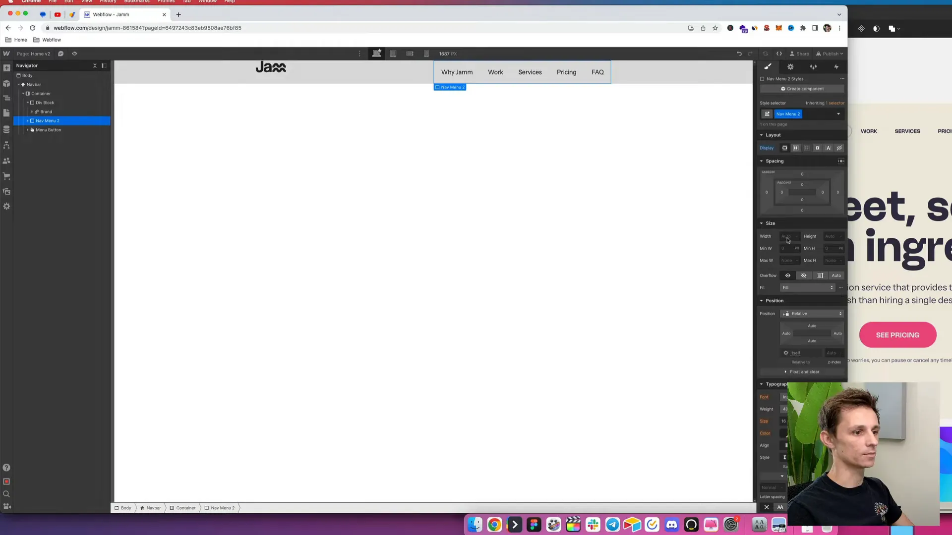
Next, we’ll make the logo display as an inline block. To ensure it’s perfectly centered, we can use a classic CSS trick. Set its position to absolute, specify the top position as 50%, and then apply a transform with a negative 50% value. This will center it effectively, making it look visually appealing.
Adjusting Navbar Positioning
To keep our navbar organized, we need to confirm that the navbar has a relative position. This is important because it ensures that the absolute positioning of the logo doesn’t disrupt the layout. Rename this div block to "logo nav logo wrapper" for better organization.
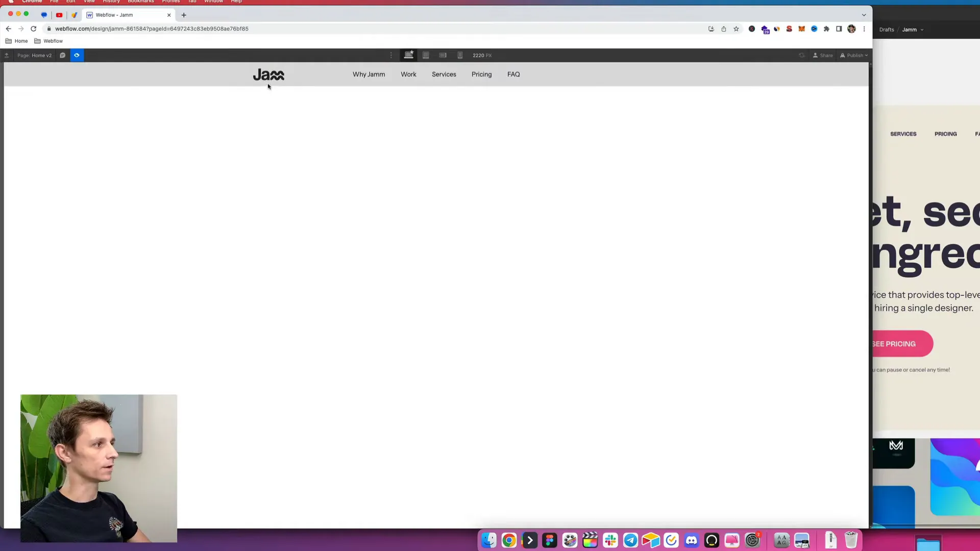
Also, we need to give this wrapper a higher z-index to ensure it’s clickable. Set the z-index to 1, and we’re almost there!
Fine-Tuning the Navbar's Width and Spacing
Next, let’s refine the navbar’s width to match the design file. The design specifies a max width of 1400 pixels. To achieve this, apply the class “container” and set the width to 1400 pixels. Remove any background color from the navbar to maintain a transparent look.
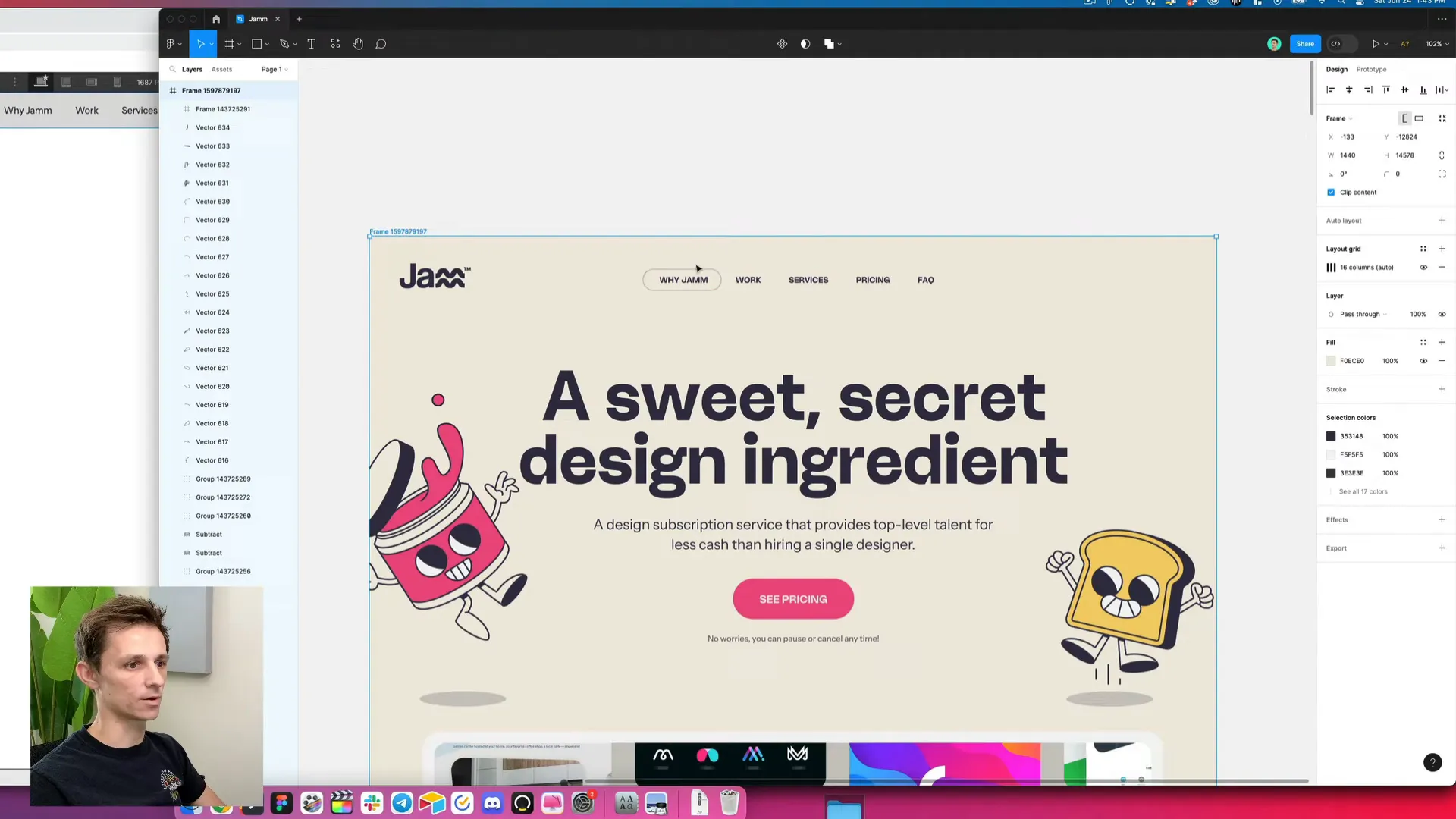
Now, let's add some space at the top of the navbar. Based on the design, it looks like we should set this to 45 pixels for a cleaner, more polished appearance.
Styling the Menu Items
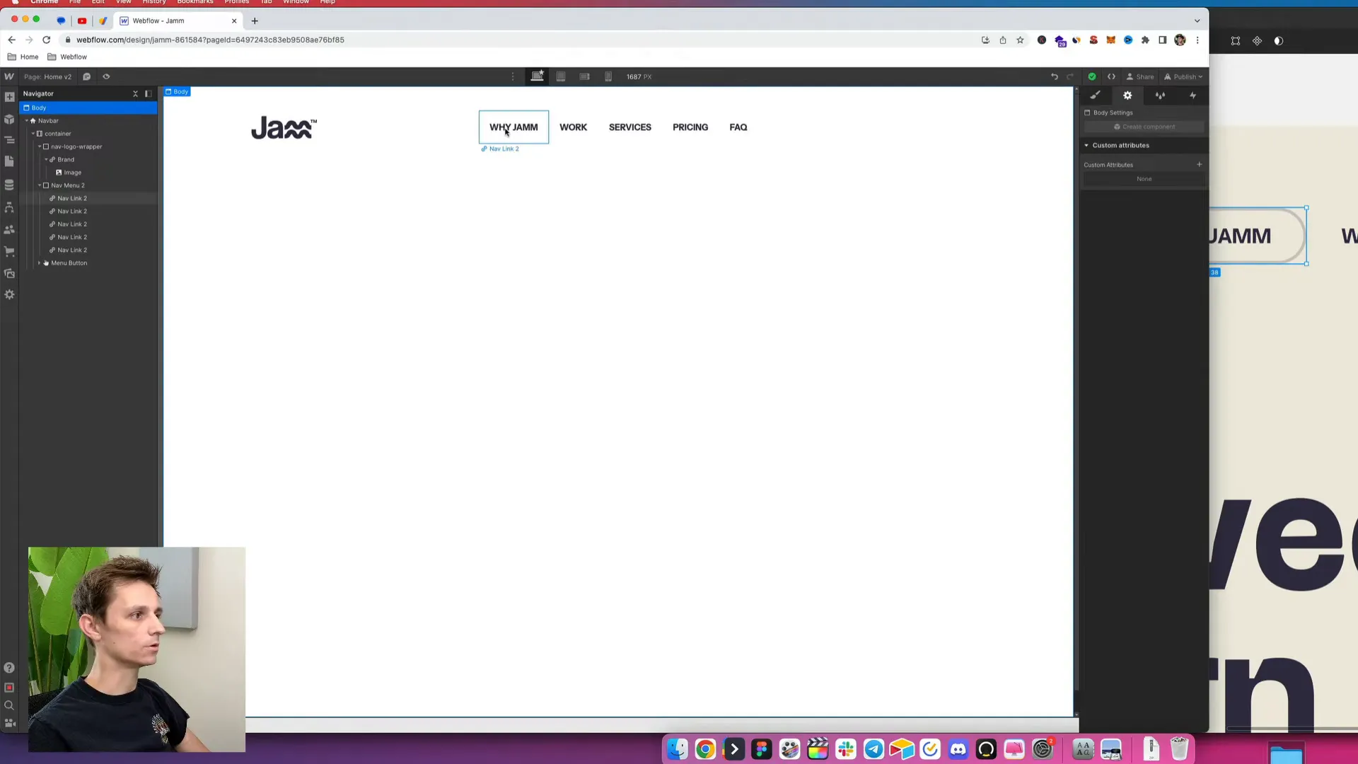
Now that our navbar is looking good, let’s style the menu items. We’ll make them all caps for a bold look. Go to the typography section, find the more options, and enable "all caps." This will ensure uniformity across all menu links.
Next, we need to apply the same styles across all nav links. We want to set the font weight to bold and match the color to the design file, which is a specific shade of black. If the logo color doesn’t match, you might need to re-export it as SVG to ensure consistency.
Adding Active States to Menu Items
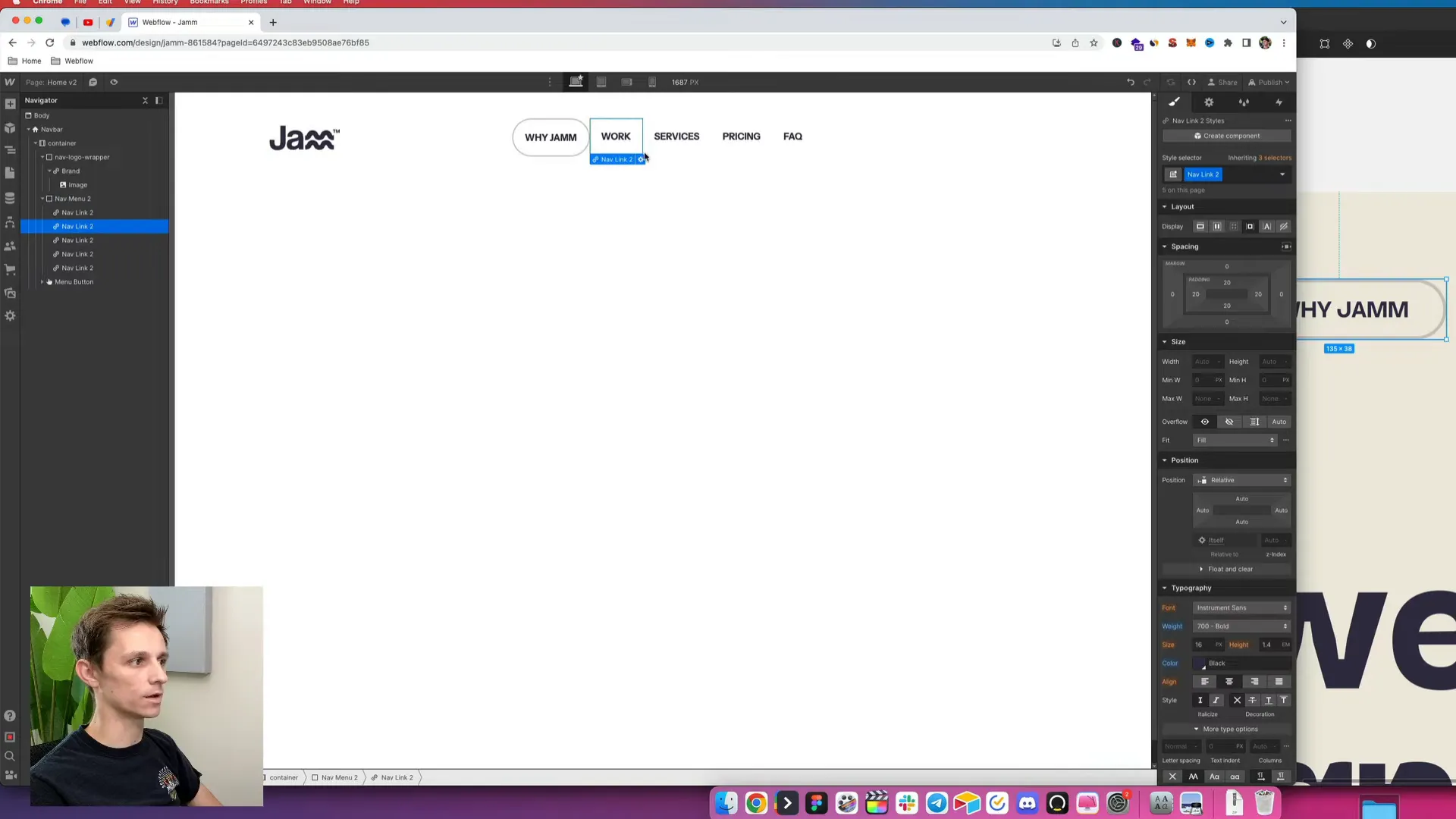
To enhance user experience, let’s add a border around the active menu item. Create a new class called “active” and set a border of 2 pixels with the desired color. Don’t forget to add a border radius to give it a smooth corner look.
Adjust the padding on the active class to ensure that it doesn’t look too tall. This is crucial for maintaining a balanced look across all menu items.
Setting Background Color and Body Styles
Next, we’ll apply a background color to the body of the page. Create a new class for this and set the background color to match the design. This will help the navbar stand out against the body content.
With the desktop view set, it’s time to consider mobile responsiveness. Given that our design file only covers desktop views, we’ll need to adapt the navbar for mobile devices.
Adapting for Mobile Views
To start adjusting for mobile, let’s examine how the navbar will look on a tablet. Ideally, we want to keep the menu items visible rather than defaulting to a hamburger menu. We’ll reduce the padding on the navbar items and adjust the font size for a better fit.
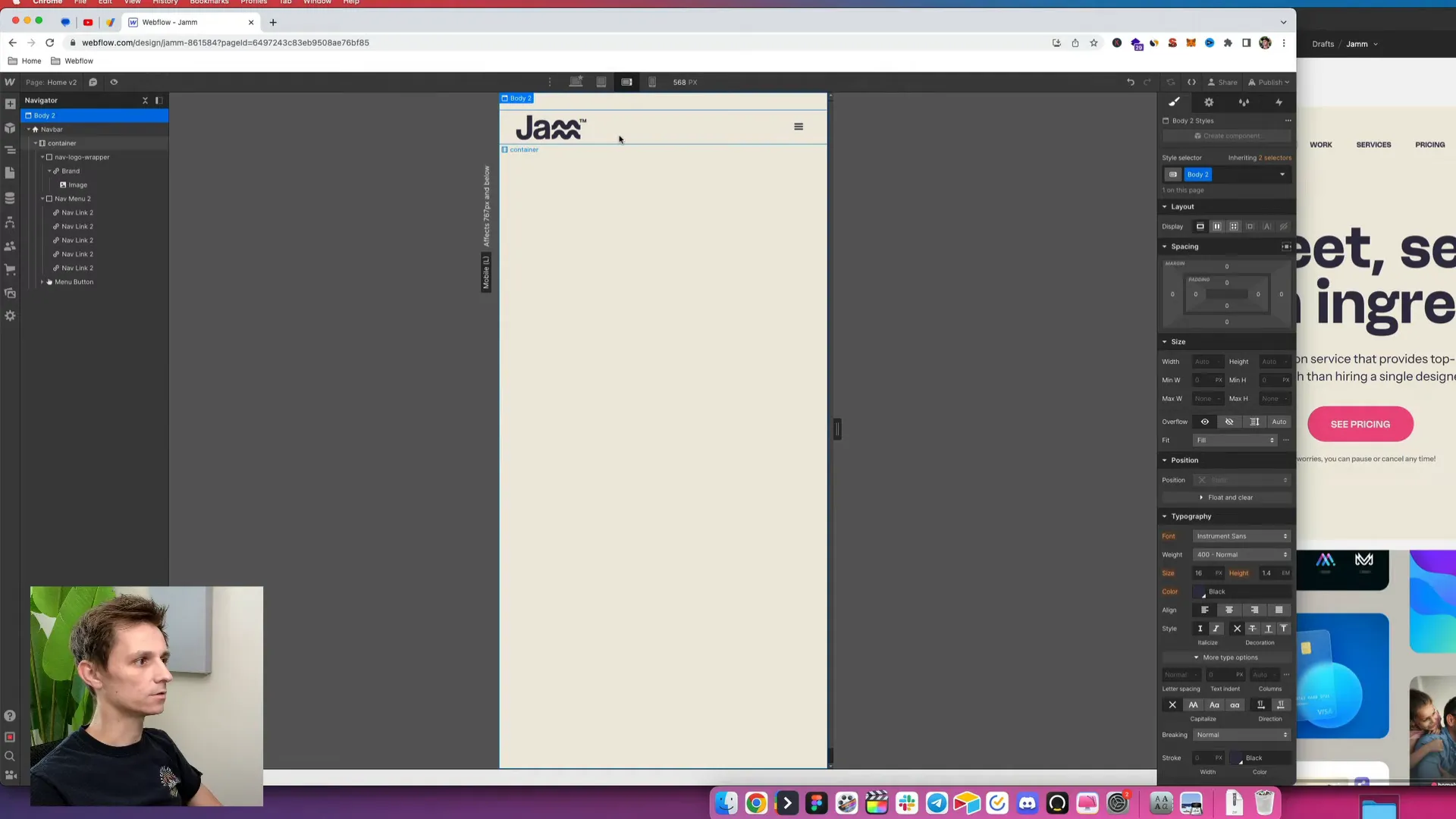
As we switch to mobile landscape view, we can further tweak the padding on the hamburger icon to make it flush with the edges. Additionally, we’ll want to ensure the logo is appropriately sized and positioned.
Final Touches and Publishing
One last adjustment will be to add a subtle shadow at the bottom of the navbar to create a visual separation between the navbar and the website content. Set the shadow distance, blur, and color to enhance the overall look.
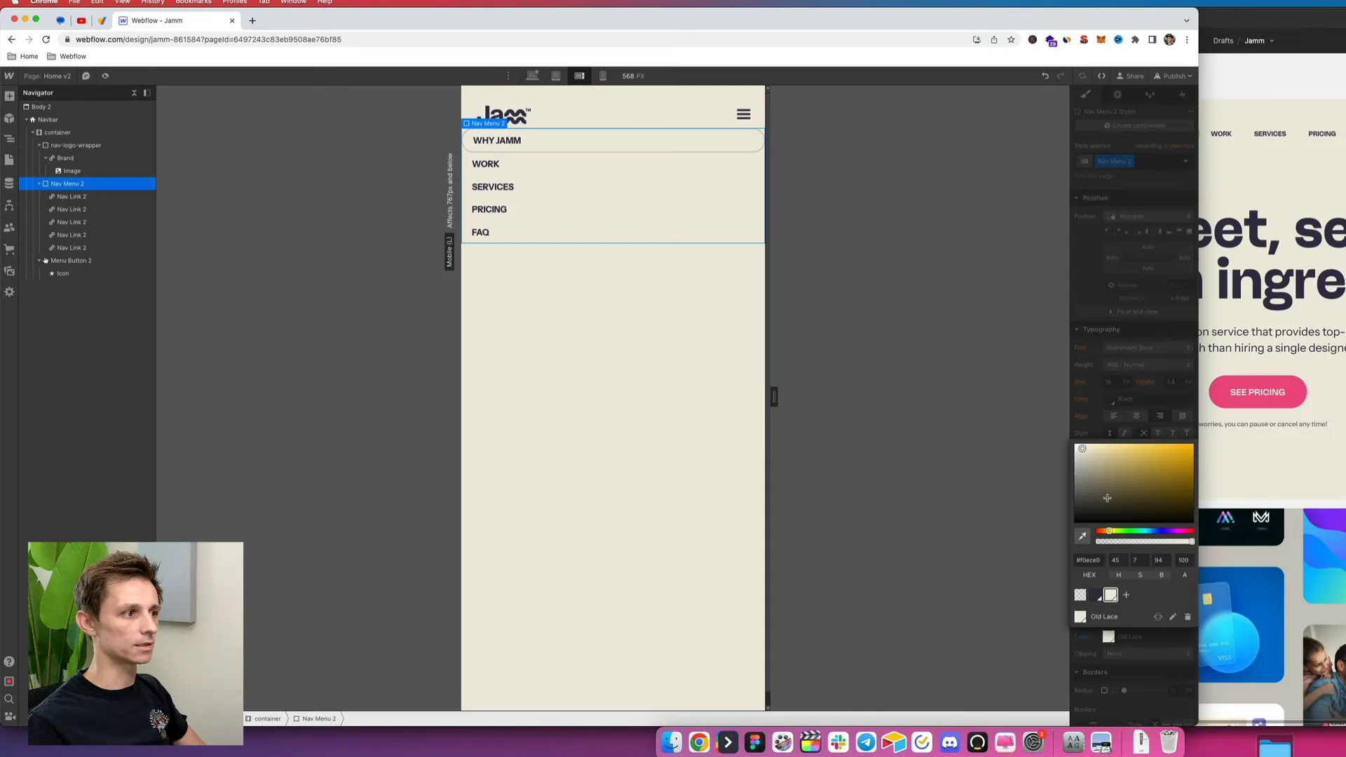
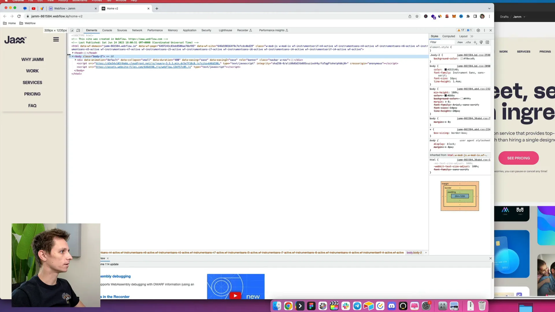
Finally, let’s publish our changes to the staging site and inspect the responsive behavior. As we resize the screen, we should see the navbar adapting beautifully to different screen sizes.
And there you have it! You’ve successfully built a stylish and functional navbar in Webflow. If you have any questions or need further assistance with Webflow, feel free to leave your comments below. I also take on Webflow projects as a contractor, so don’t hesitate to reach out if you need help!
Thanks for following along, and stay tuned for more episodes as we continue to design this Figma project inside Webflow!


