Today, we’re diving into the world of Webflow to explore how to create a responsive navigation menu. Navigation bars are crucial for any website, providing users with a clear path to access different pages and features. In this guide, I'll walk you through the process of building a navigation menu from scratch, including styling, responsiveness, and additional elements like dropdowns and buttons.
Getting Started with Webflow
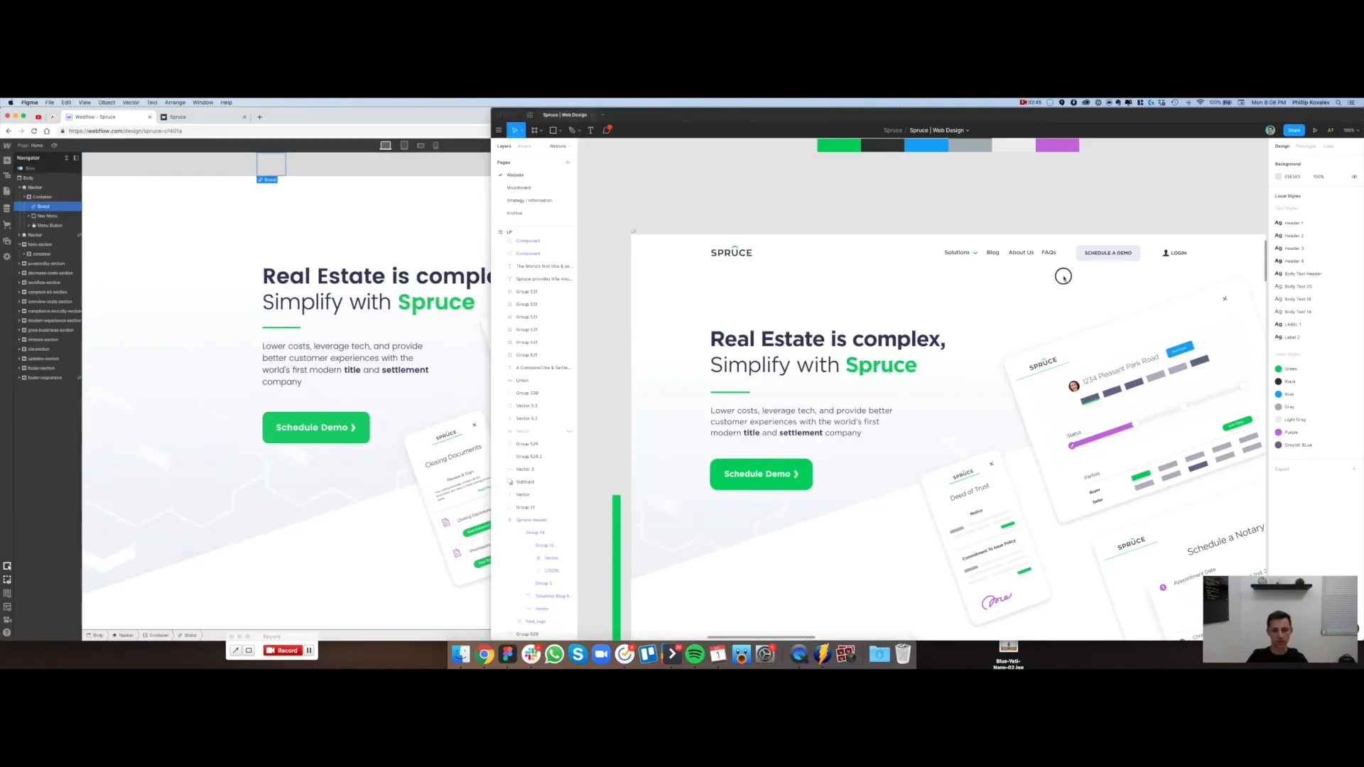
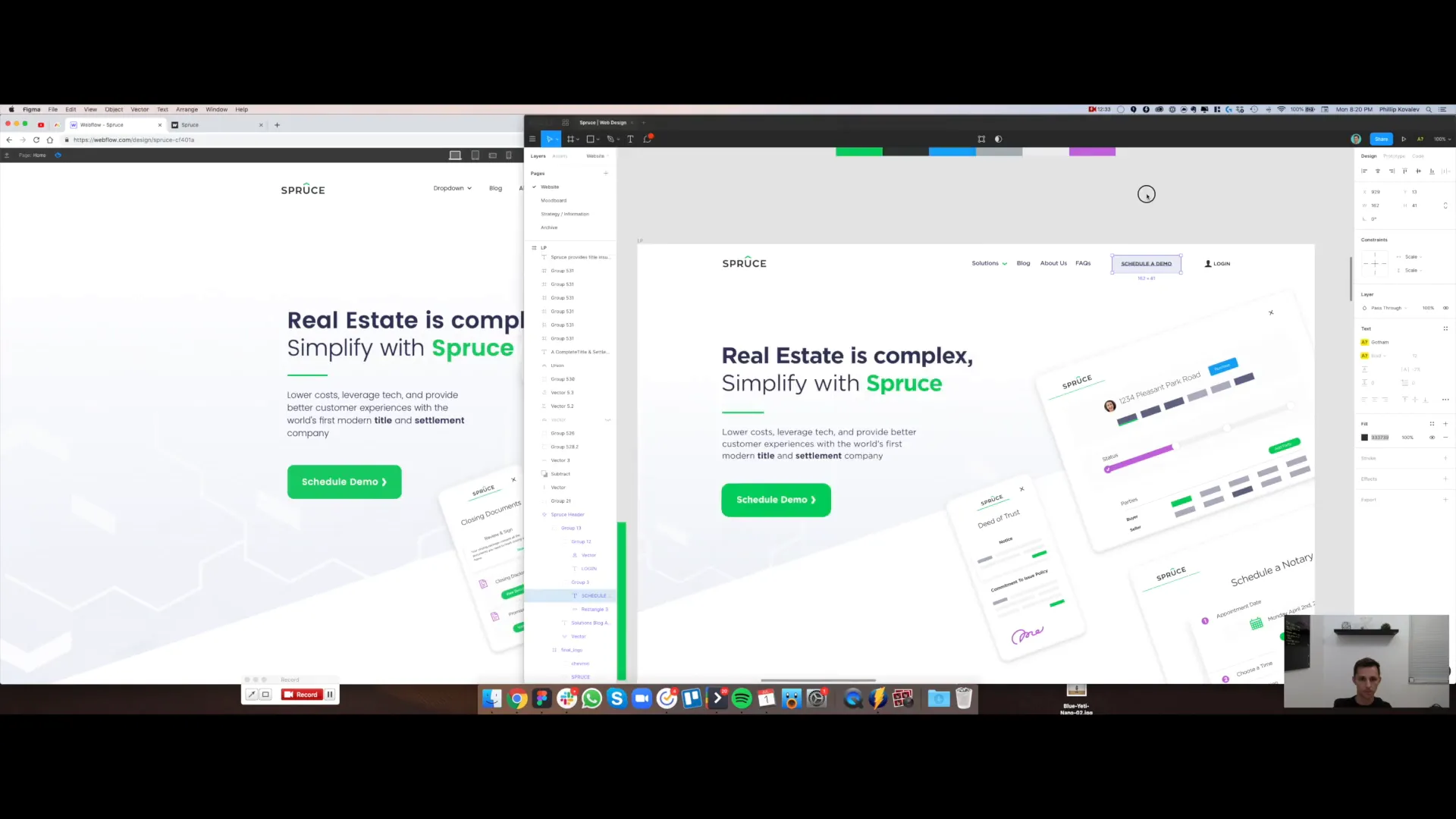
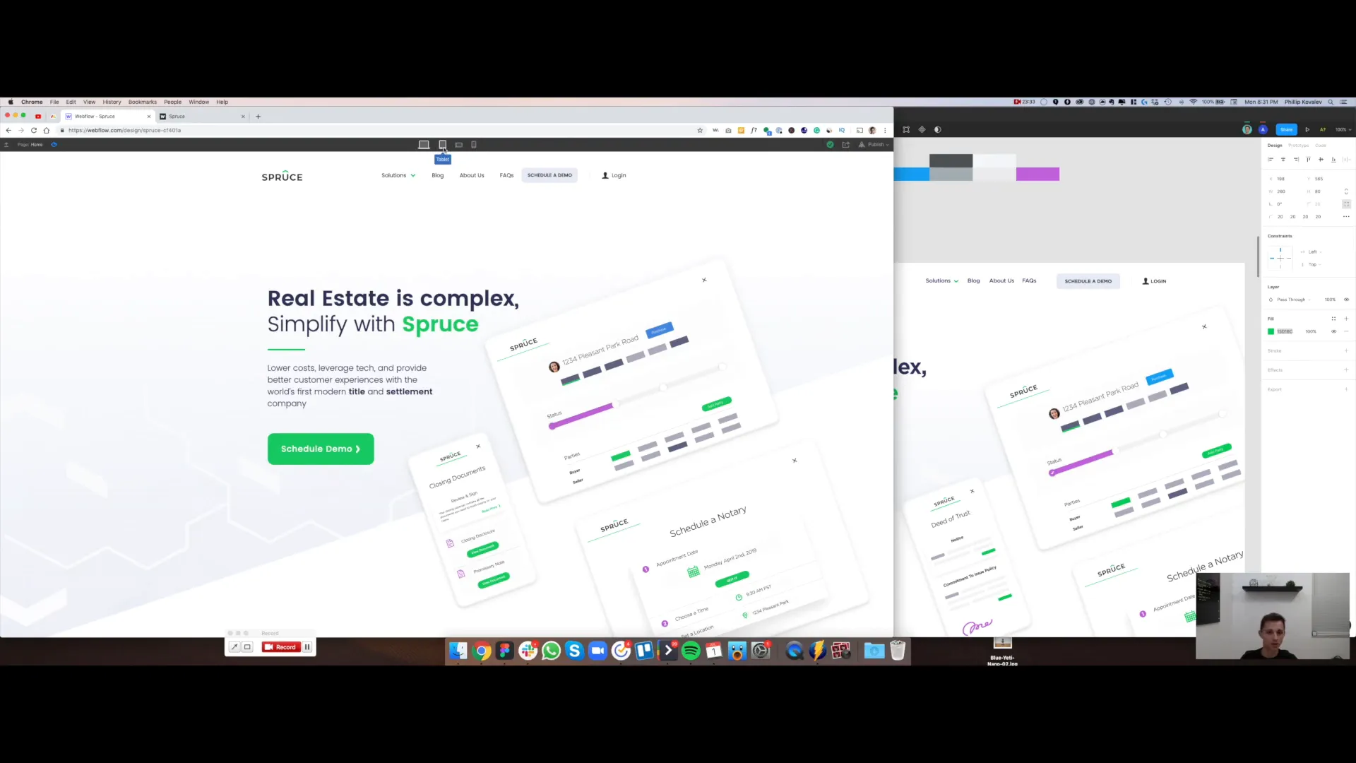
To kick things off, let’s open our design file in Webflow. While it may look basic at first, we’ll turn it into a fully functional navigation menu. The design we’re aiming for includes a logo, several links, and buttons that aren't typically found in standard navigation menus. If we look at our live page, we can see a simple dropdown menu already in place, but it’s not styled yet. That’s where our work begins.
Creating a New Navigation Menu
First, we need to clear out the existing menu. Select the current navigation and hit the hide button. Then, click the plus button to add a new navbar component. Drag this component to the top of the page. When we do this, we’re greeted with a blank navigation menu that has an empty image slot, a link, and a toggle menu. Let's take a look at the preview mode.
Adding the Logo
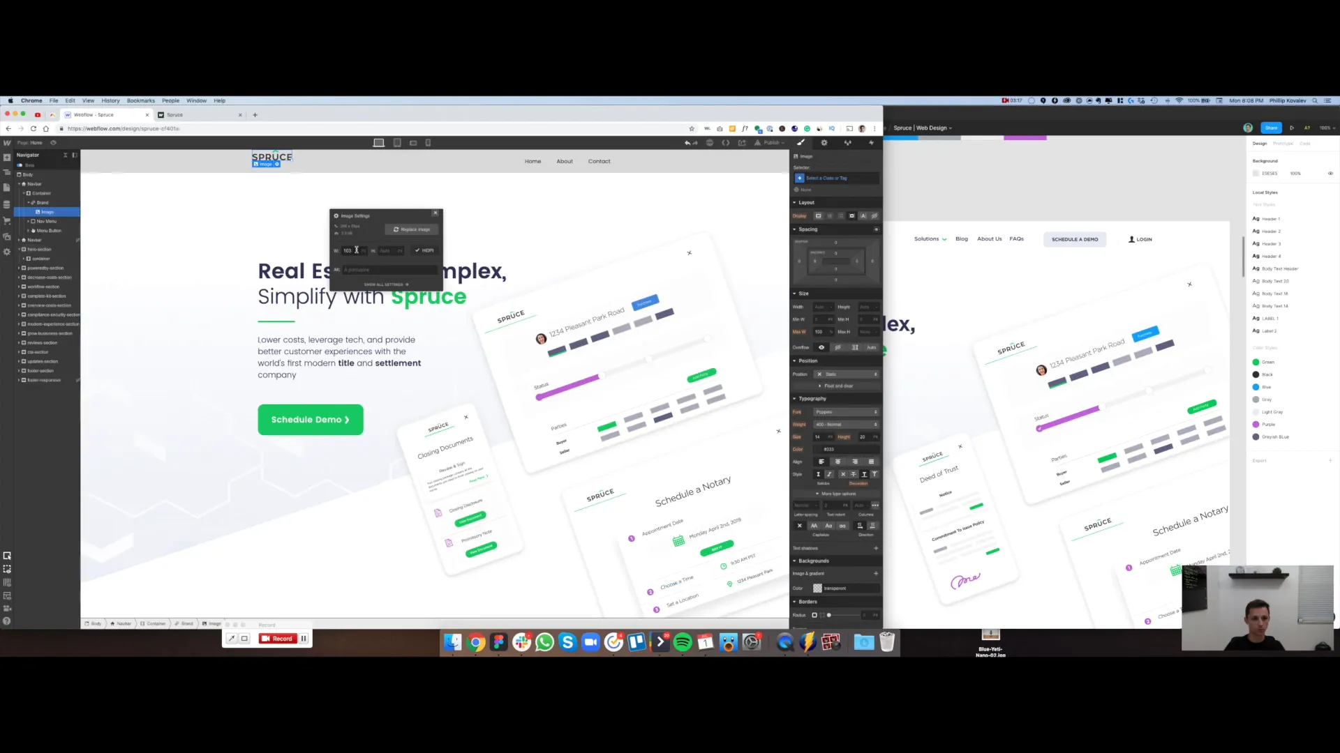
Next up, we’ll add our logo to the navigation. Go to the plus menu, select the image option, and place it in the designated box. Choose your logo file, ensuring that you select the HDPI option for retina displays. This is crucial for modern screens. Remember to use SVG files whenever possible for scalability.
Creating Navigation Links
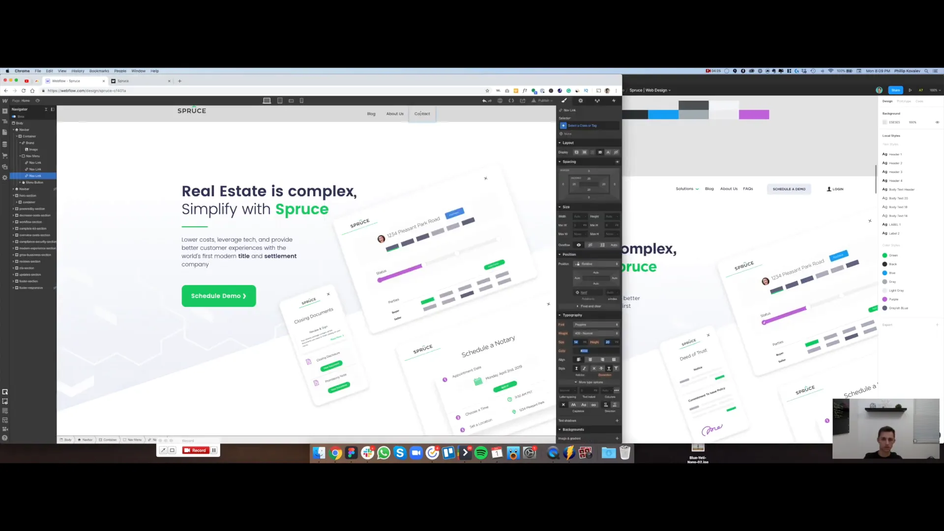
With the logo in place, let’s add our navigation links. We’ll start with "Blog," "About Us," and "FAQs." Double-click the placeholder text to edit it accordingly. Once we have all three links set up, we can move on to creating a dropdown menu.
Building a Dropdown Menu
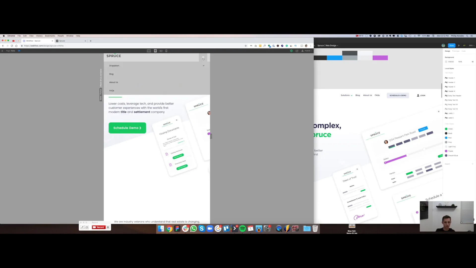
Creating a dropdown menu in Webflow is straightforward. Click the add elements button, scroll down to find the dropdown component, and drag it into the navigation area. In the HTML structure, we can see that it’s properly nested within the navbar. Let’s check the preview mode to ensure everything is functioning correctly.
Adding Buttons to the Menu
Now, we need to add the remaining buttons. Exit preview mode and head back to the add elements section. Find the button component, drag it in, and duplicate it for our second button. Label one button "Schedule a Demo" and the other "Login." At this point, we need to address the spacing issues; the buttons are misaligned compared to the nav links.
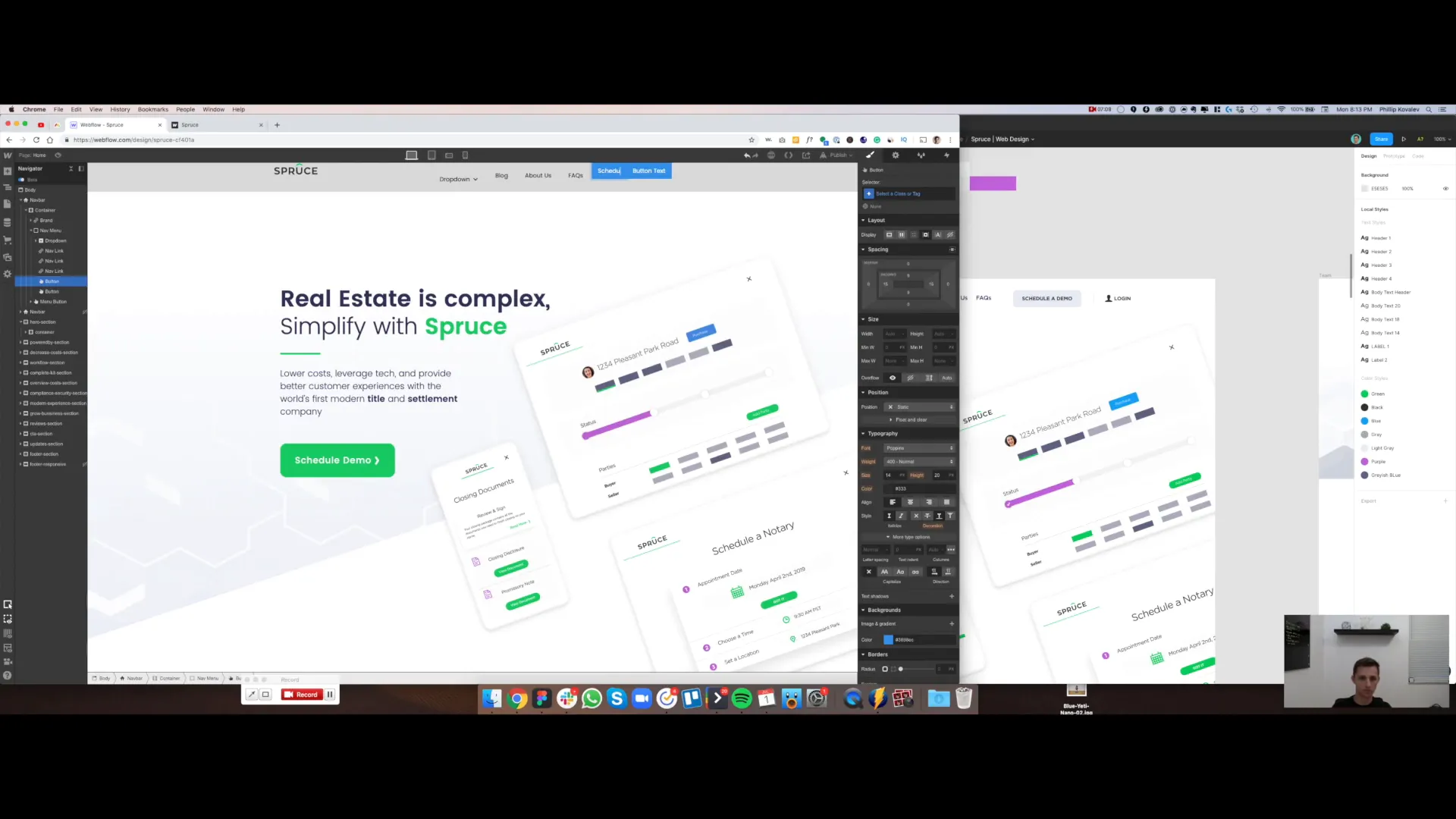
Centering Elements
To achieve a polished look, we need everything centered. Select the navigation menu and apply a flex layout. Set the alignment to center, and now everything should look aligned. However, we also need to ensure the logo is centered with the nav links and buttons.
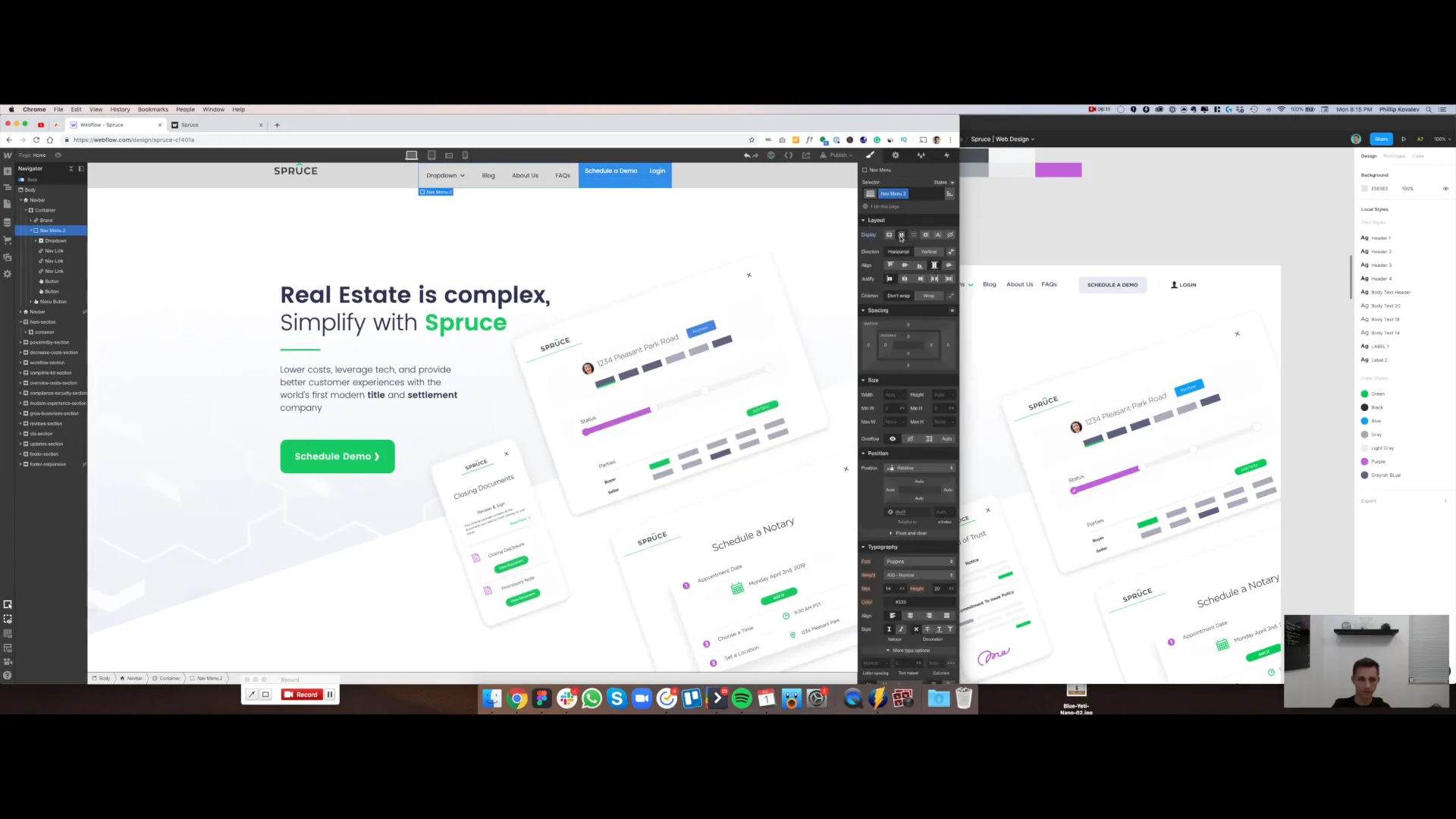
Organizing the Structure
To properly center everything, we’ll wrap the logo and navigation links in a new div block. This allows us to apply flex properties without affecting other elements. Once both elements are inside this div, create a class named "navigation inner" for easy reference. Set its display to flex and align it to the center.
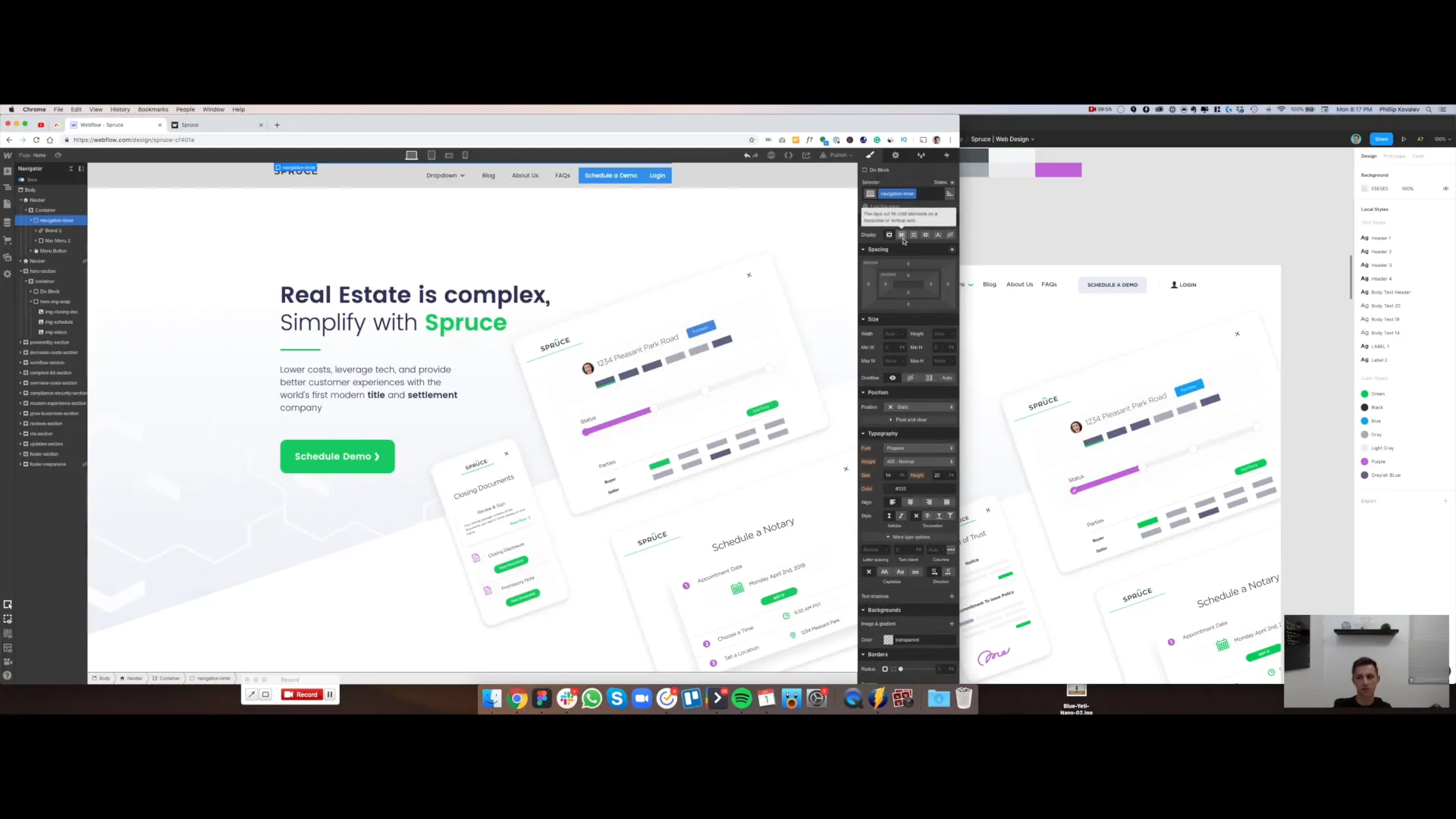
Styling the Navigation Menu
With the layout in place, let’s tweak the styling. Start by adjusting the padding at the top and bottom to around 30 pixels. We’ll also change the background color to transparent, which will make our navigation look much cleaner and more in line with our design.
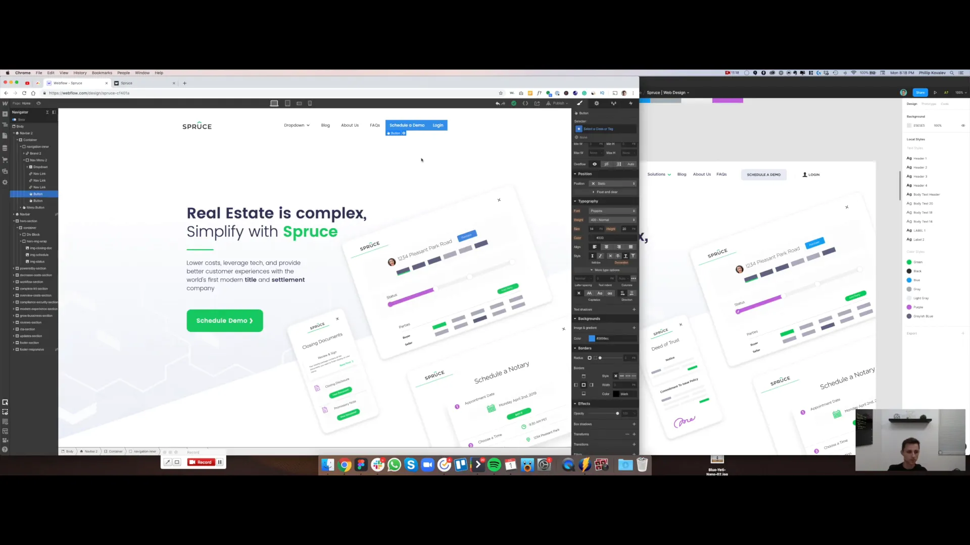
Button Styles
Next, we’ll work on the buttons. Give the first button a class of "button" and set a border radius of 8 pixels for a nice rounded look. Copy the button's background color and create a new class named "button gray." This will allow us to reuse this style across other buttons without needing to recreate it.
Finalizing Button Designs
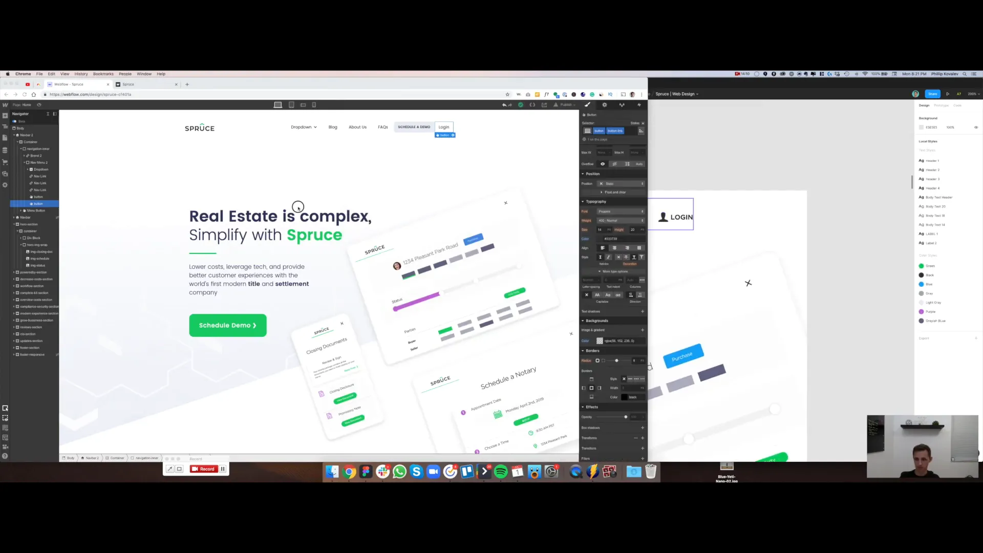
Let’s adjust the typography for the buttons. Set the text to all caps and change the font size to 12 pixels. Now we’ll move on to the login button. Assign it the class "button" and "button link." This button will not have a background color, so make it transparent. Adjust the text color to match our design.
Adding Icons
We’ll also add an icon to the login button. Select the button, go to the background images section, and upload the avatar icon we extracted earlier. Set its dimensions to 17 pixels, ensuring it doesn't repeat. Center the icon within the button for a polished look.

Styling the Dropdown Menu
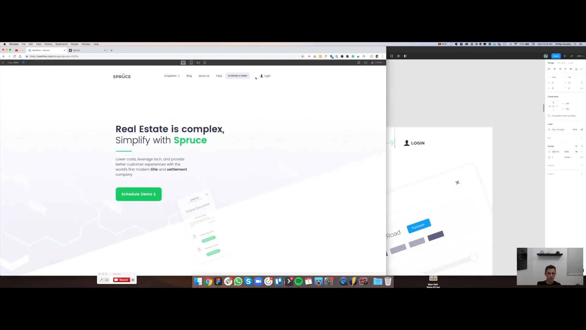
Now, let’s focus on styling the dropdown menu. Click on the dropdown menu and change its background color to white. Add a subtle drop shadow to give it a more professional appearance. We’ll also adjust the border radius to about 4 pixels for a rounded effect.
Hover Effects for Dropdown Links
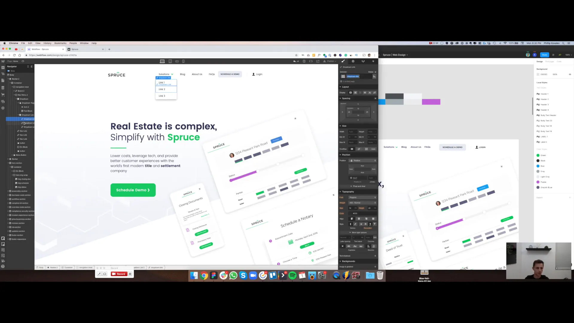
To enhance user experience, we’ll add hover effects to the dropdown links. Create a class named "dropdown-link" and apply it to all dropdown items. Set the hover state to change the text color to green, which will provide visual feedback when users interact with the links.
Responsive Design Considerations
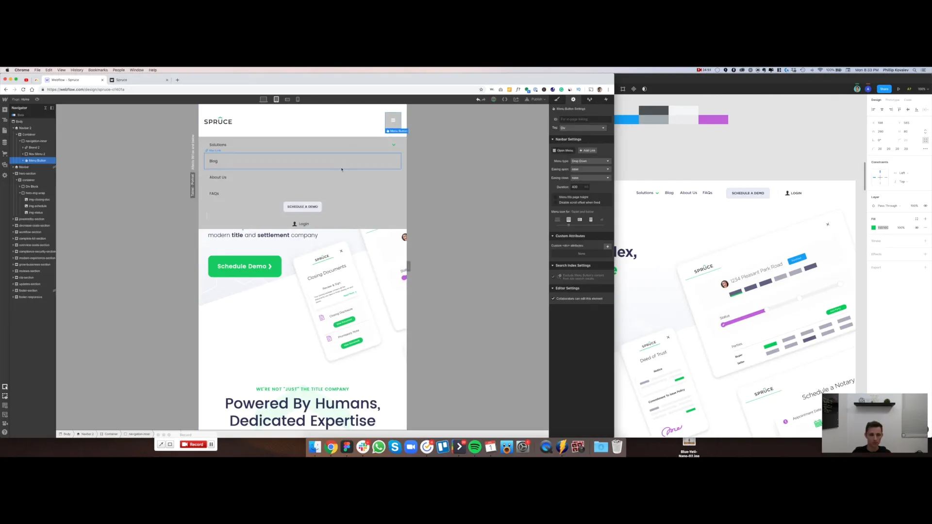
Once we have our desktop design set, it’s time to make sure it looks good on all devices. Check the tablet view and adjust any misalignments. If necessary, hide elements that don’t look good on smaller screens, like borders or specific styles that don’t translate well to mobile.
Final Touches
Now, let’s check the mobile view. Make adjustments to ensure the dropdown menu displays correctly and is easy to navigate. Ensure that buttons have adequate spacing and that the overall design is cohesive across all devices.
Conclusion
And there you have it! We’ve successfully created a fully functional and responsive navigation menu in Webflow. This guide demonstrates the ease of building complex navigation systems while maintaining a clean design. If you have any questions or need further assistance, feel free to leave a comment below. Don’t forget to hit that thumbs up if you found this tutorial helpful, and subscribe for more Webflow tips and tricks!


